Centre for Indigenous Theatre
An Overview
As part of my Information Architecture (IA) course at the iSchool, I worked with Darren Clift, Jessica She, and Zinah Adwan to produce a prototype redesign for the Centre for Indigenous Theatre (CIT), a national theatre school based in Toronto. Engaging directly with the community partner as a client we were able to gather user research, conduct stakeholder interviews, and perform usability testing with current users of CIT’s website, and future users of our proposed redesign.
CIT’s current website presents basic information about the school, such as the organization’s history, program description, gallery of past plays, opportunities to donate, etc.. However, the existing website fails to deliver a sense of focus and consistency to users. We set out to increase the functionality of CIT’s website for both its users and administrators, the latter being responsible for the site’s maintenance. Other goals included making the website more legible and coherent in both its organizational structure and presentation, simplification of the current design of the website, and the removal of broken links and out-of-date content.
Understanding CIT and the User
In order to increase our understanding of CIT we executed three core exercises:
- Semi-structured interviews with CIT’s primary stakeholders and current students,
- A content inventory and analytics of the existing CIT website, and
- Usability testing with the existing CIT website.
1. Semi-Structured Interviews
During the interviews, the students expressed an appreciation for the variety of available information on the website, particularly program tuition costs and alumni profiles. However, they lacked interest in the CIT site because of the out-of-date information, poor navigation, faulty utility, and lack of purpose of many elements. The student users identified that updated information regarding the history and alumni of the Centre for Indigenous Theatre and program information, such as the program description, tuition fees, admission requirements, and application form, would be the most valuable content to them. Students and stakeholders also reported that they would like to see more dynamic content on the homepage, as well as a dedicated blog or new bulletin to spread news, promote events and activities, and connect the centre to the greater Indigenous community.
2. Content Inventory & Analytics
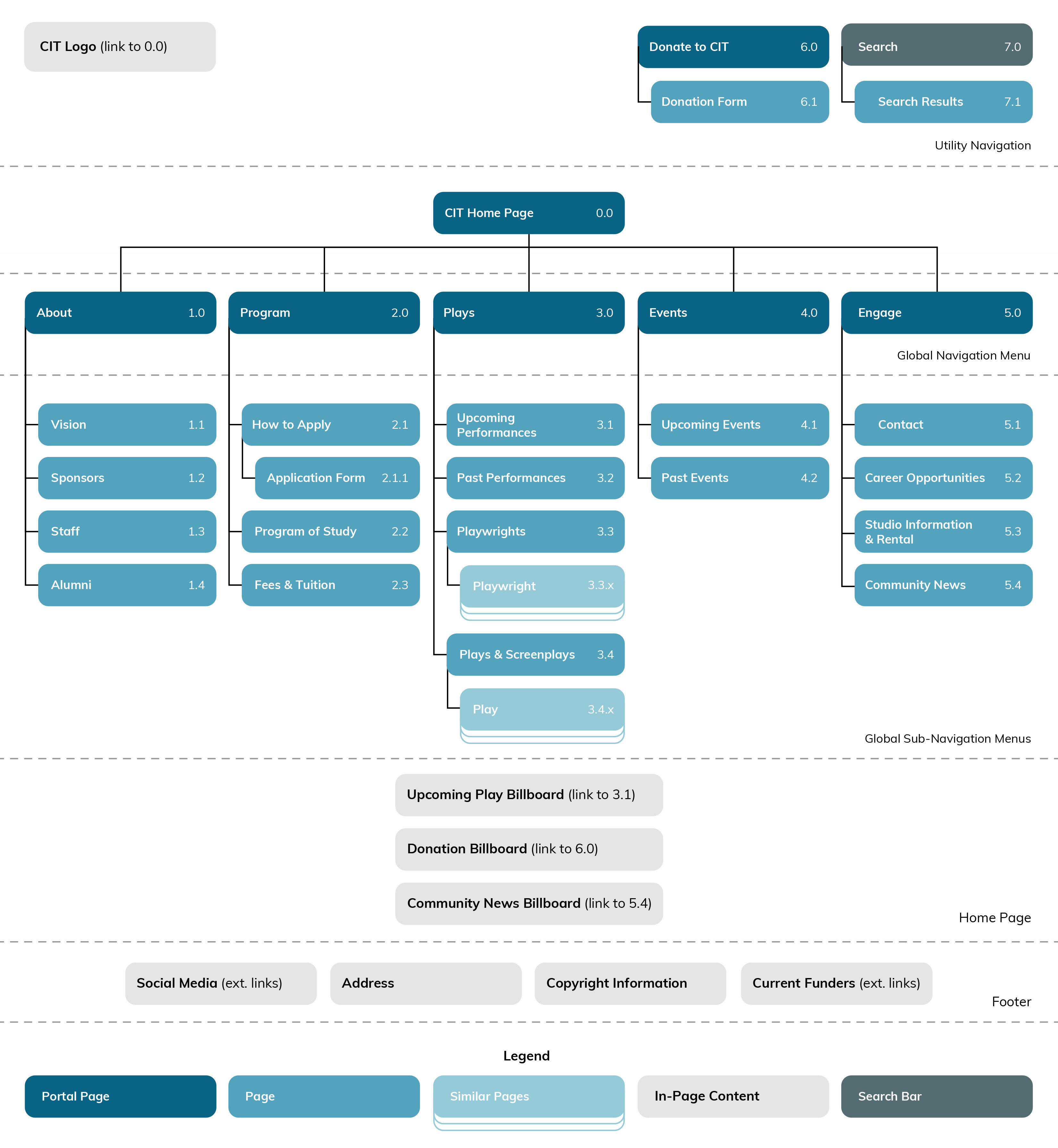
A content inventory of CIT’s website was performed using the following tools: 1. Content Insight (content-insight.com), which analyzes the number and types of files on websites, and 2. Weebly hosting analytics, which were provided to us by the client. These reports revealed that current CIT website offers very limited navigation categories and content. There are currently five categories in the global navigation menu, which are ‘Home’, ‘About’, ‘Program’, ‘Show Gallery’, and ‘More…’, and minimal subcategories in the dropdown menus. Although the website has elements of top-down information architecture, it lacks bottom-up information architecture, apart from the CIT logo in the header of each page which returns the user to the homepage.
3. Usability Testing
Utilizing task-based testing with students and staff at CIT, and representative student users at the University of Toronto’s iSchool, we identfied pain points and issues with the organization and navigation of the current website. The main issues raised were:
- Site is hard to navigate
- too few menu items to immediately find what they are looking for
- labels did not accurately describe the content and were not standardized
- Inconsistency in the presentation of information
- some pictures lack captions
- captions appear in different sizes
- Content is hard to read
- animated slideshows use fast transitions and small font size
Towards a New Design
1. Card Sorting
The next step in our design process included a card sorting test, using Optimal Workshop, which was performed on representative users at the University of Toronto and stakeholders at CIT. The study was an open card sort which allowed participants to suggest the categories of the global navigation menu based on the cards we provided. This test gave us insight into the level of clarity and consistency of the current labelling structure of CIT’s website and provided us the opportunity to test some of our suggested labels and organization. We used the results to inform the content of our drop down menus and to eliminate many of the redundant and unclear labels from CIT’s current design.
2. Storyboarding
Lorem ipsum…


3. Medium Fidelity Prototype
Using the information gathered in earlier phases, we produced a clickable prototype using Figma. It incorporated the following components:
-
Navigation
The website’s navigation was reorganized to include several elements:
- a more succinct global navigation menu
- a utility navigation menu consisting of:
- a ‘Donate to CIT’ button
- a search bar
- a fat footer consisting of:
- links to social media (originally hidden on secondary page)
- CIT’s email (originally hidden on secondary page)
- current sponsors
- bottom-up navigation via breadcrumbs
We also redesigned the home page adding three embedded content billboards to guide users to key content: 1. upcoming plays/events, 2. donate to CIT, and 3. community news.
-
Community News Bulletin/Page & Program of Study
As per our interviews, student users expressed that there was little content on the site that pertained to their needs; for example, students expressed wanting more content about upcoming events and important dates for their courses. Our redesign responded to these needs through a community news billboard on the homepage, and a secondary ‘Community News’ page under the ‘Engage’ menu as suggested by the card sorting exercise. We have also included a more detailed ‘Program of Study’ page, including a program calendar for the current year of study with relevant dates for students.
-
Search
While search wasn’t identified as a priority for the CIT website, it is an important component given the expanded breadth of the redesign. As part of the header’s utility navigation search functionality is accessible via all pages. Search results are sorted by subject/topic and content type, for example “Staff” and “Students”. Users can decide what kind of information is returned when searching, to avoid irrelevancy and confusion. The CIT website caters to various demographics, so search functionality must afford these different user groups with the same ease of use.

Centre for Indigenous Theatre website search results page. -
Donation Page
Donations and fundraising was a main concern of our client and was addressed by adding a dedicated ‘Donate to CIT’ page that is accessible from a link in the utility navigation. The link’s placement, at the top-right corner of the page, ensures visiblity and ease of access. The new ‘Donate to CIT’ page will include information on the donation process, how donations will impact the centre, and a donation form. Providing additional information to users regarding the impact of their donations will help them make informed decisions.

Centre for Indigenous Theatre website donation page.
What’s Next?
Now that we have the medium fidelity prototype more user testing is needed, especially in terms of how the site will be viewed by users in remote Indigenous communities. Users in these communities can have restricted access to internet and bandwidth due to limited resources and costly fees of service, and they are a potential user base of CIT particularly with respect to CIT recruiting, and families and friends of current students. We will inquire about the methods that could stagger loading times or limit auto-loading of certain content (such as high-resolution images and video) to allow for greater accessibility in these situations.